View
Go to case study

Reducing costs with a re-platform and full site redesign

Robert Graham re-platformed to Shopify Plus. With that, I had the opportunity to refresh their site with a number of custom designed pages and elements.

My Roles: UX/UI Design, Art Direction
Tools: Figma
Industry: Apparel

Business goal

Robert Graham needed to re-platform their ecommerce site. The original was hard to manage, had security issues, was too costly, and was not the most optimized user experience. Through discovery conversations with the client, it became apparent that personalization, the ability to schedule content, and improved information architecture were needed. It was determined in the sales process that Shopify would be the platform to help solve some of these issues.

The customer's problem

When customers land on the site, the current UX prevents them from having the best experience when browsing for products.

My role

As the lead designer, I was tasked with feature discussions, wireframing, designs and an information architecture audit. This also included art direction for Robert Graham's ecommerce photography.

Discovery

The kickoff

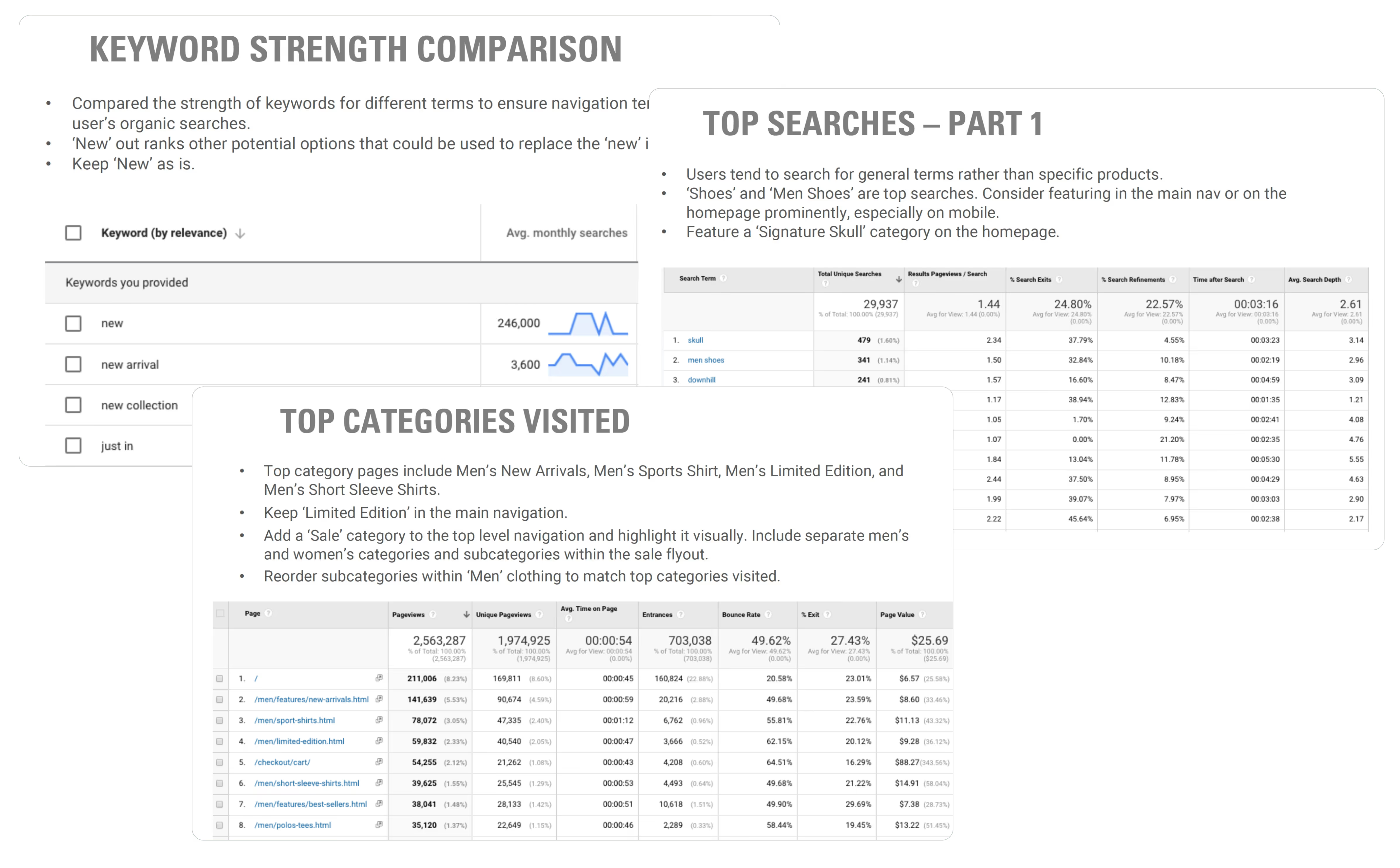
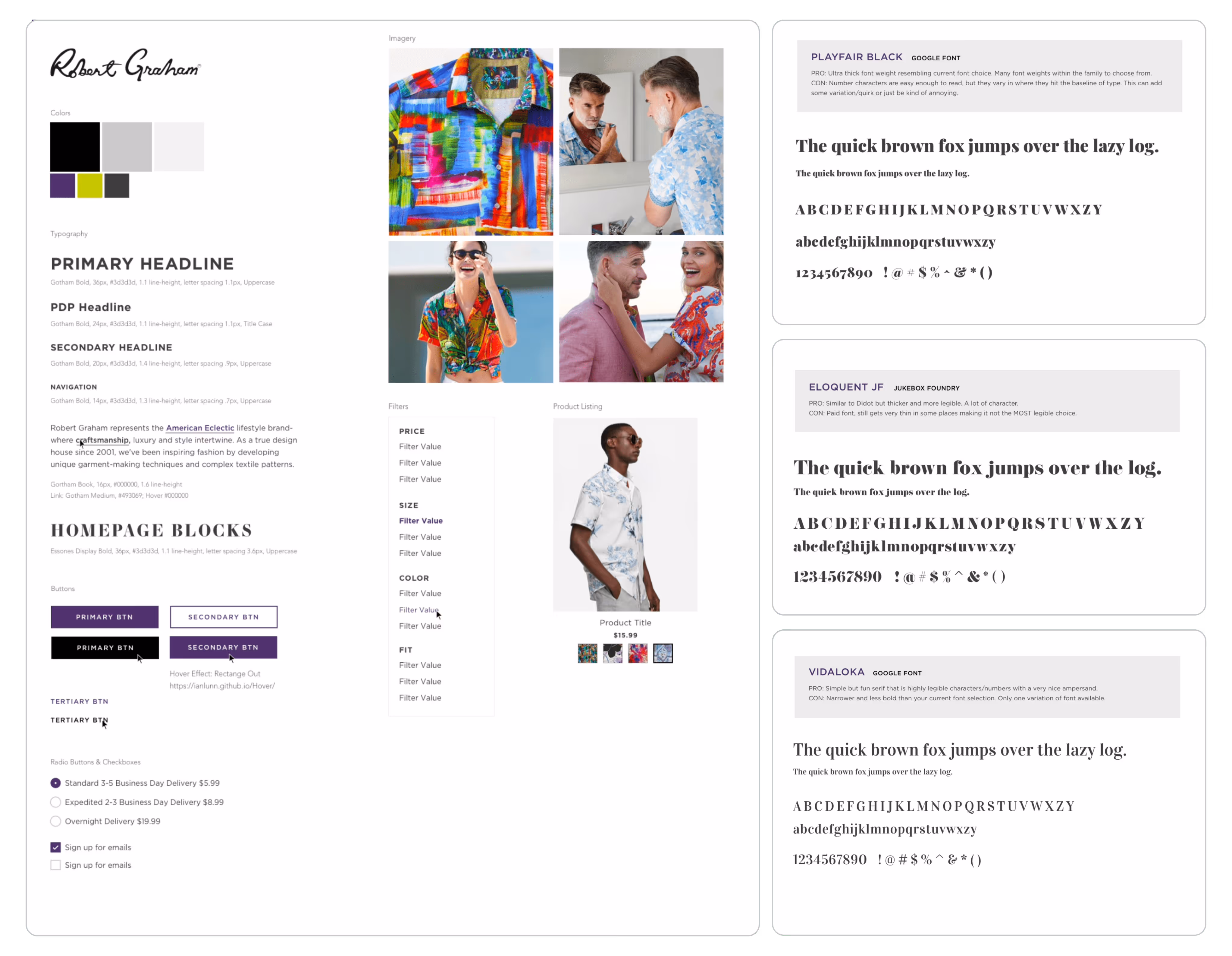
Part of the important work upfront is speaking with the client and understanding their audience, objectives, tone of voice, and brand messaging. I put together a creative brief that compiles this information to ensure the client and team are all on the same page. I also included comparative research to get their insights on what design elements fit with the brand.

Two overlapping pages of a creative brief document detailing client information, audience segmentation by customer types, current data on customer demographics, goals and objectives for a Shopify build project, and target attributes.
Illustration of a person with gray hair, wearing a purple jacket, yellow shirt, white pants, and brown shoes, sitting on a gray stool with one arm extended.

Who is the customer?

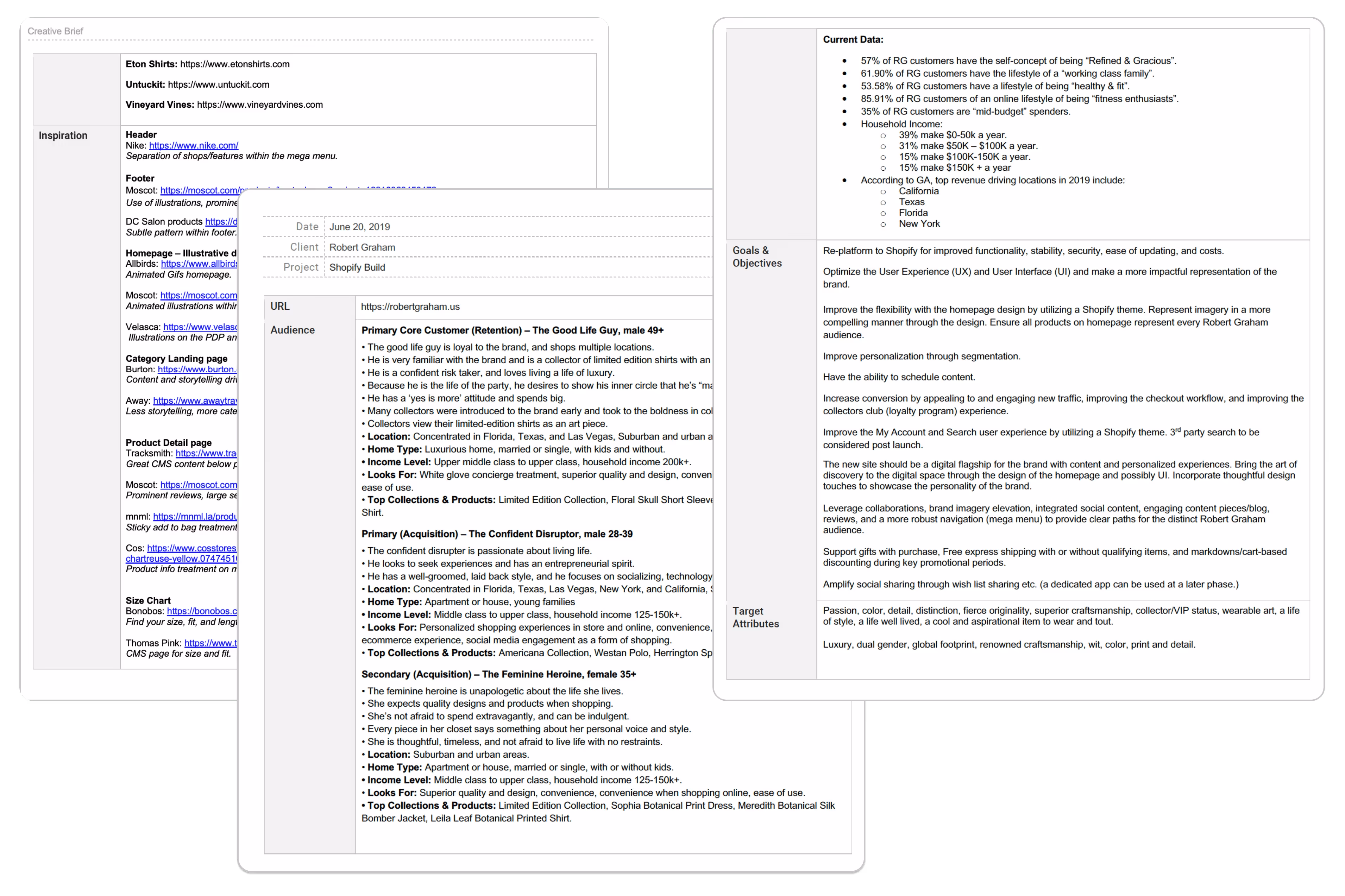
The primary customers of Robert Graham are men who are loyal to the brand and collectors of limited edition shirts. They are risk takers and tend to spend big. Age tends to be 49+ and they are heavily concentrated in Florida, Texas, and Las Vegas. Though this is the primary customer, the business had ambitions for acquiring a younger audience and expanding upon the women's collection.

They want an elevated experience

Through discovery conversations with the Robert Graham team, I came to understand that customers value the in-store shopping experience. There, customers can feel the fine fabrics, study the details of patterns, and browse like they are looking for an art piece.

1. How do we translate pattern details successfully on the site?
2. How do we allow customers to browse seamlessly?
3. How do we speak to all audiences on the homepage?
4. How can we simultaneously provide better flexibility to the business?

Two overlapping pages of a creative brief document showing brand details, customer personas, current user data, goals, objectives, and target attributes for a Shopify website build.

Feature alignment

With the questions above in mind, I gathered the features that would come with Shopify along with those that would be extra development into one feature list to present to the client. Through this discovery we determined key features that would help the business move forward including scheduling content, expanding the navigation into a mega menu, providing social sharing through wishlist, an additional size chart, improvements to search and account, and a redesign of the product detail page (PDP). This aligned us on the work that needed to be done, and gave clear expectations for the team.

Three analysis report screenshots showing Keyword Strength Comparison with monthly search volumes, Top Searches Part 1 with search term metrics, and Top Categories Visited with page analytics data.

Improving IA

The site navigation needed a revamp. With the help of our Data Analytics team, I analyzed top onsite and organic searches, top categories visited, and did keyword strength analysis on their current terms. I also researched competitors' navigations. A few changes I concluded were:

  • Reordered some categories based on relevancy
  • Added a 'sale' top-level category
  • Renamed some categories based on keyword searches
Two-page sitemap layout for Robert Graham website showing main navigation, utility navigation, footer sections, and detailed categories for Men’s section with various navigation hierarchy levels.

New navigation

With the information architecture audit in mind, I created a new sitemap to test the new category reorganization.

Two overlapping tables listing website features and descriptions for a Shopify theme, including sections like Responsive Front End, Promo Banner, Header, Homepage Carousels, and Newsletter Integration with corresponding URLs.Three overlapping panels showing keyword and website analytics: 'Keyword Strength Comparison' listing keywords like 'new' and 'new arrival' with monthly search volumes; 'Top Searches - Part 1' table highlighting search terms like 'skull' and 'men shoes' with stats on searches and pageviews; 'Top Categories Visited' summary and data table on pageviews and bounce rates for men's clothing categories.Sitemap diagram showing SM Robert Graham website navigation with utility navigation, main navigation, footer, and detailed SM Men category with subcategories and filtering options.

Design

The fun part: wireframes to designs

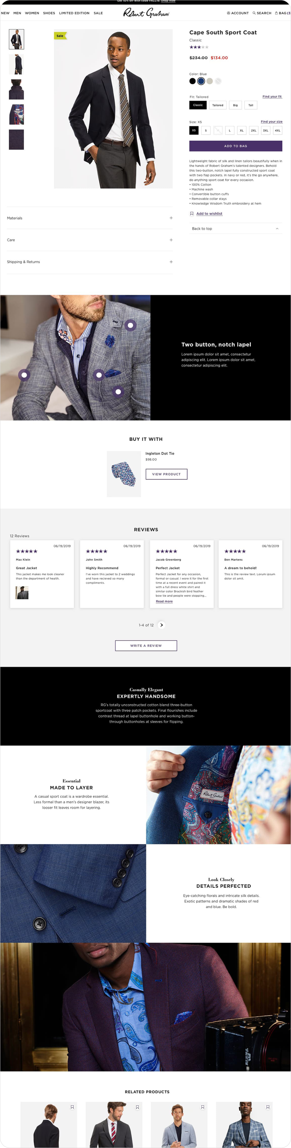
Robert Graham's collections are full of whimsical patterns and bold colors. The site needed to allow those delightful details to shine through the UI, without overpowering the products themselves.

Wireframe layout showing a product page with menus, product images, ratings, prices, color and fit options, fit selection popup, and size chart details.

Wireframes

Before moving into high-fidelity designs, I created low-fidelity wireframes to establish the structure and hierarchy of the new Shopify site. My primary focus was on the PDP and the Homepage, ensuring that we could accommodate high-resolution imagery and "pattern-heavy" content without cluttering the user interface.

Two pages of a functional specification document showing details of a mobile menu system and shoppable lifestyle carousels for mobile and desktop, including menu interaction points and carousel frame components.

Functional Specs

I outlined all wireframes into a functional spec document annotated with desired functionality. This document was key in aligning the engineering team and the client stakeholders on what needed to be built. The QA team also used this document to create test cases.

Robert Graham brand style tile showing logo, color palette, typography styles, button designs, radio buttons, imagery of vibrant shirts and styled people, filter options, and font previews for Playfair Black, Eloquent JF, and Vidaloka.

Style exercise

With a re-platform comes the ability to rebrand UI elements. The Robert Graham team was happy with the current colors, but they were open to new typography choices. I presented a few options before creating the full web pattern library.

Design system pattern library showing color palette, typography styles, responsive header, footer, buttons, forms, product listings, and favicon options.

UX pattern library

I created the pattern library to be the foundation of the brand's web presence. Not only did the engineering team use this to create base styling for the build, but it also served as reusable components for any future projects.

E-commerce interface wireframe showing a side menu for men's clothing categories, product detail overlay with price and color options, fit selection pop-up, and size chart modal.Two overlapping pages showing a mobile menu specification on the left with expandable categories and account option details, and a shoppable lifestyle carousel specification on the right for mobile and desktop views with product images, hotspots, and call-to-action buttons.Robert Graham style tile showing logo, color swatches, typography samples, homepage text blocks, buttons, radio buttons, product images, and font examples with pros and cons.Design pattern library showing colors, typography for desktop and mobile, responsive header and footer layouts, filter interface, button styles, form alerts, product listing with images, and favicon sizes.

Designs

Mega Menu

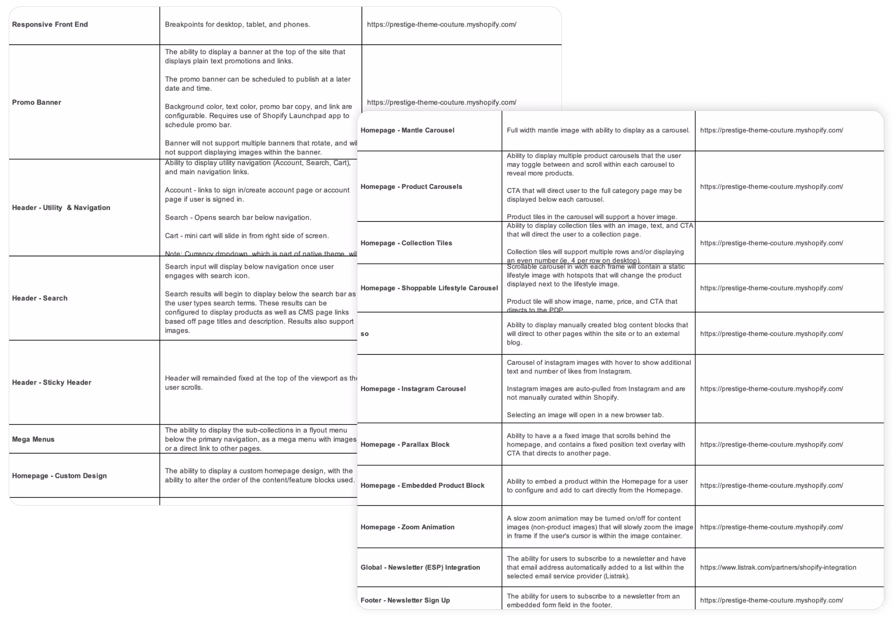
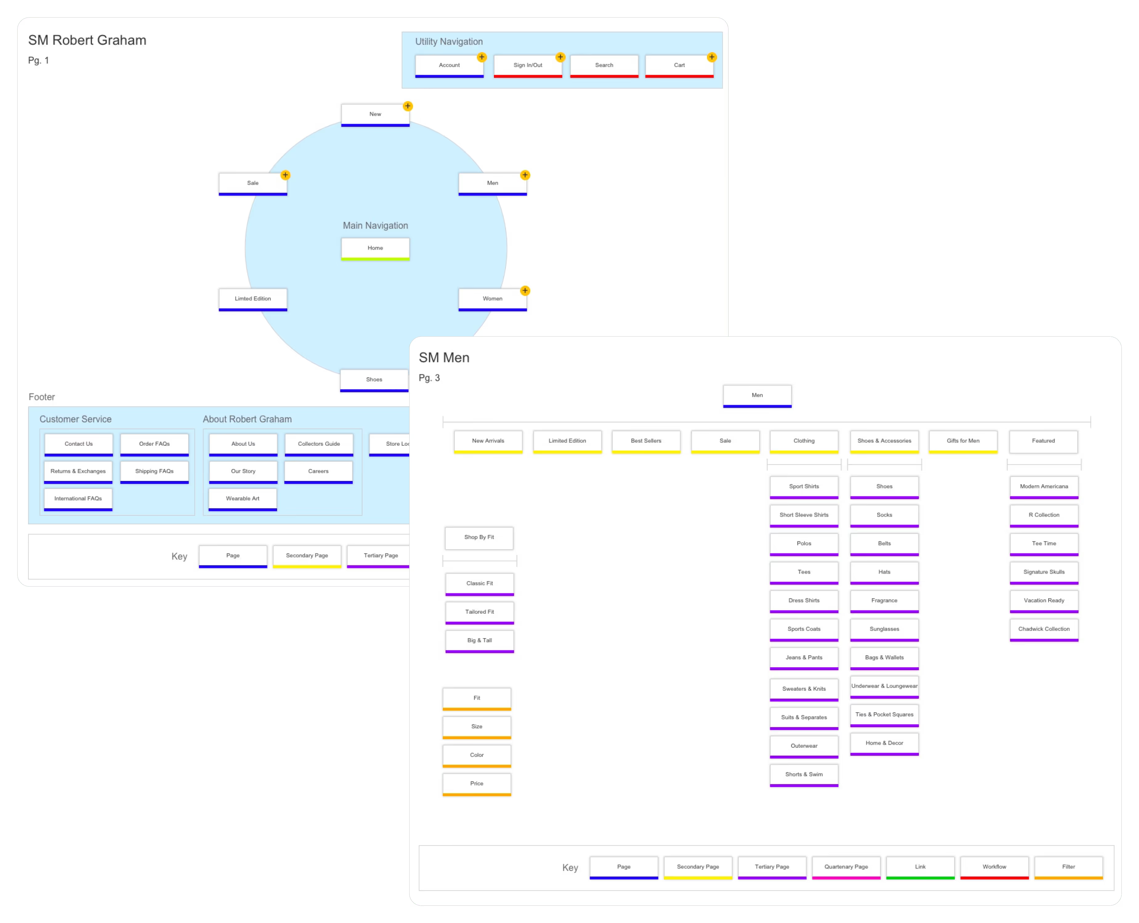
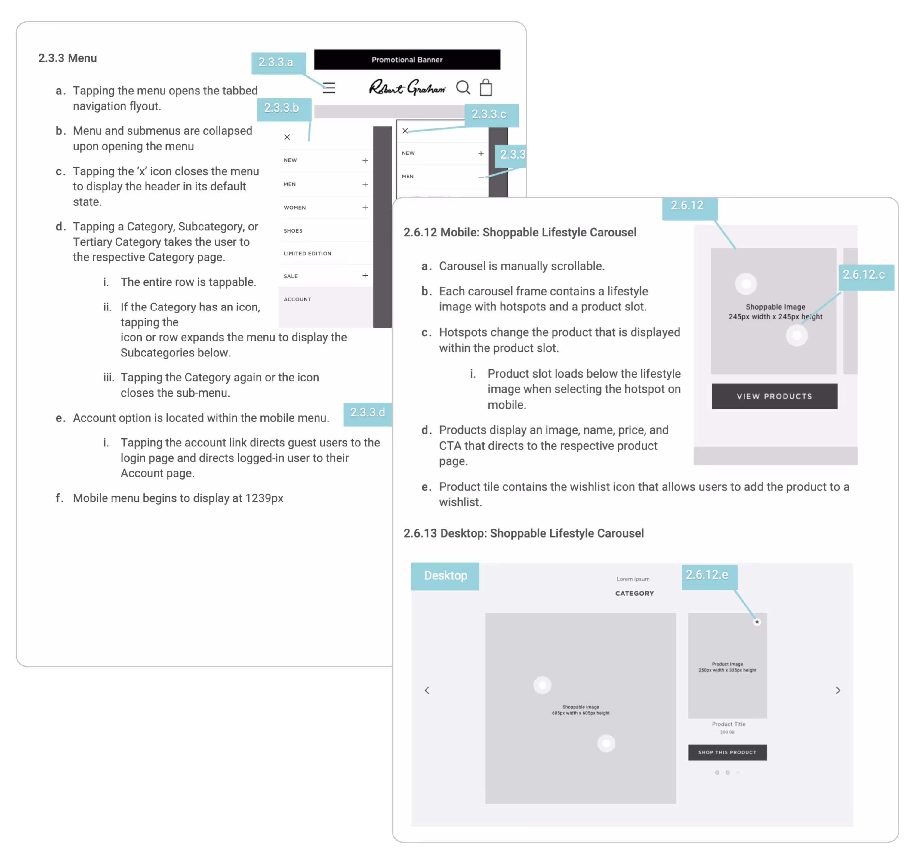
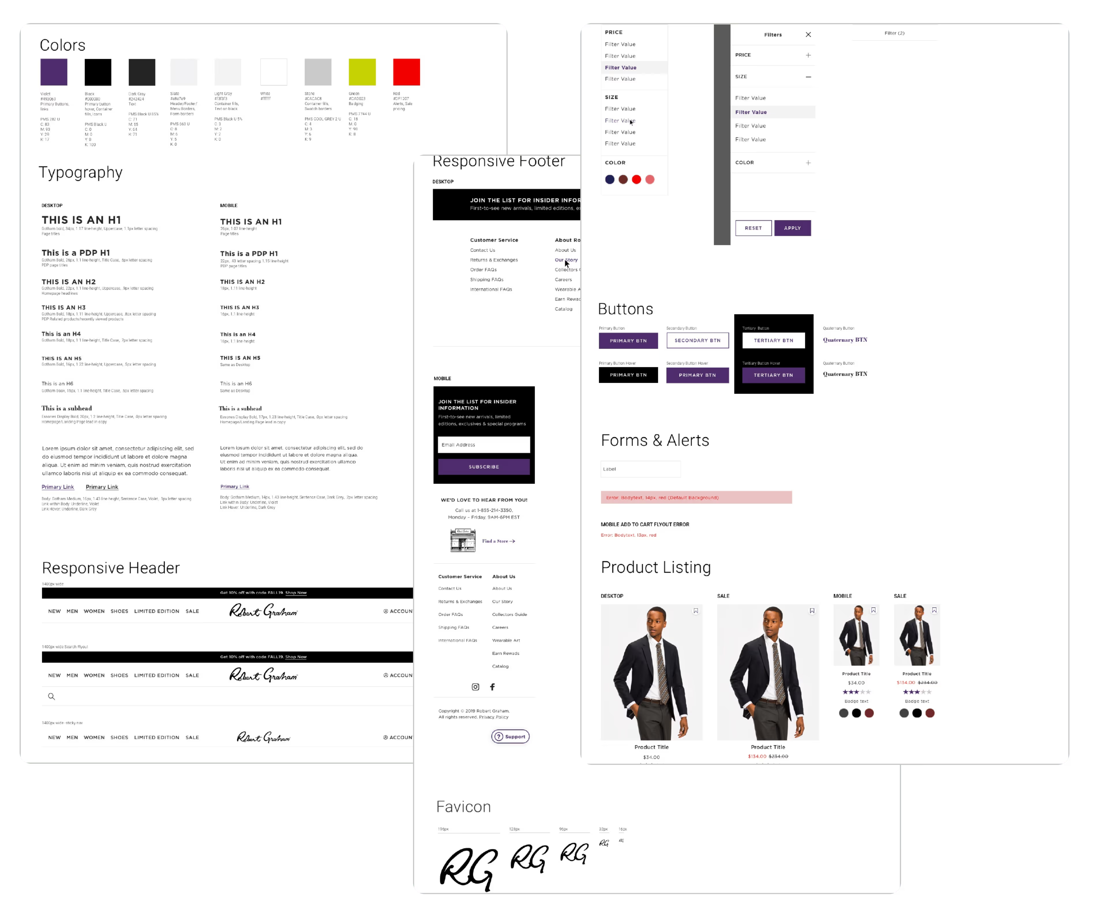
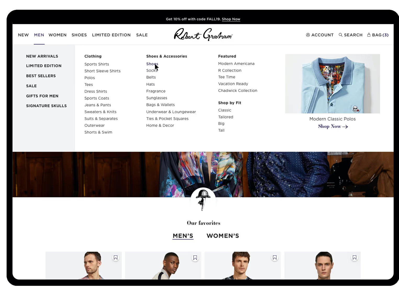
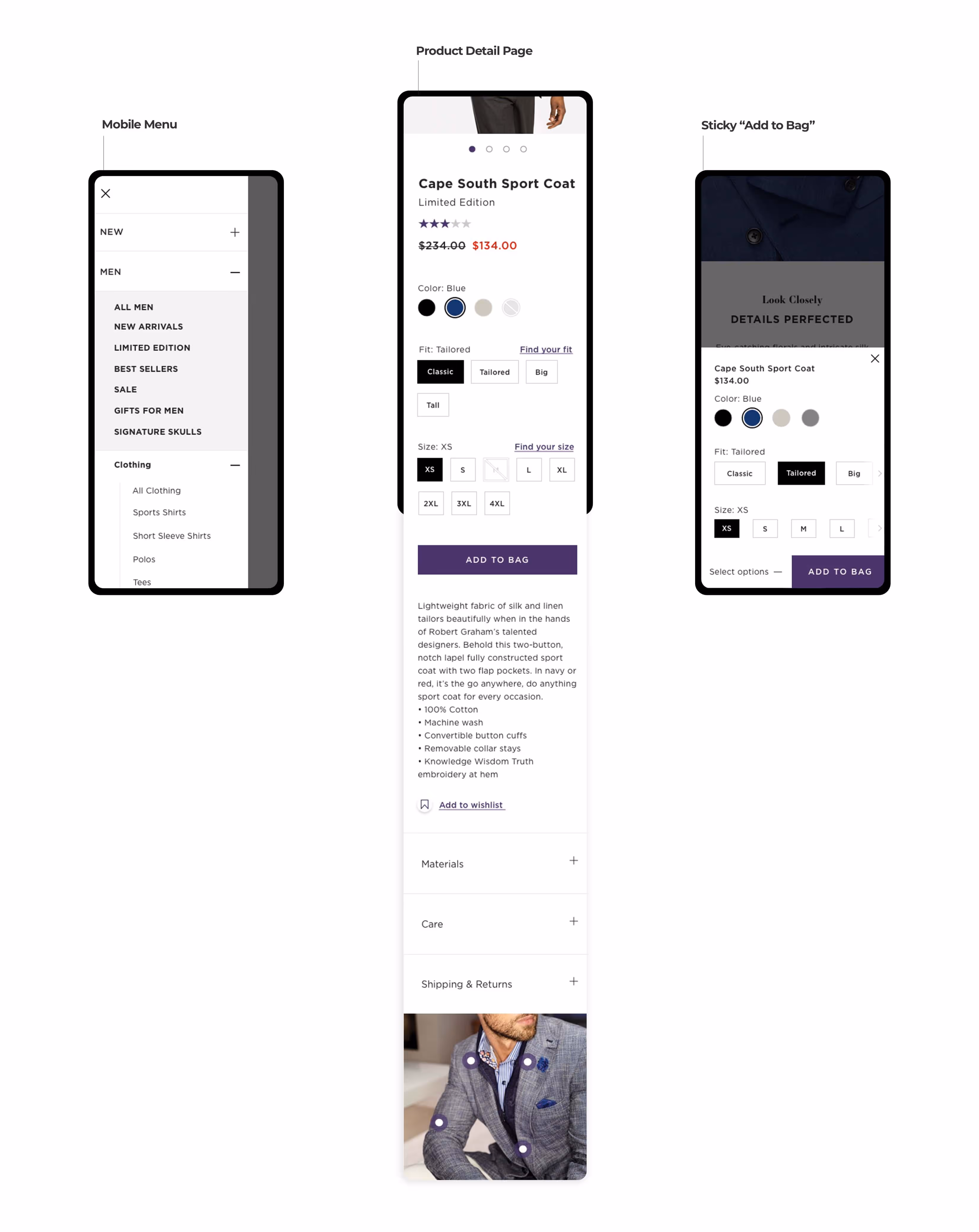
Informed by the information architecture audit and revised sitemap, the new menu allows for a robust level of subcategories and added attribute navigating. A CMS spot allows for a feature callout that can be scheduled to change.

Icons

The brand guidelines included beautiful legacy illustrations that I neatly folded into the UI. One is within the homepage banner to move users down the page, and another in the footer. Little touches speak to the brand's voice.
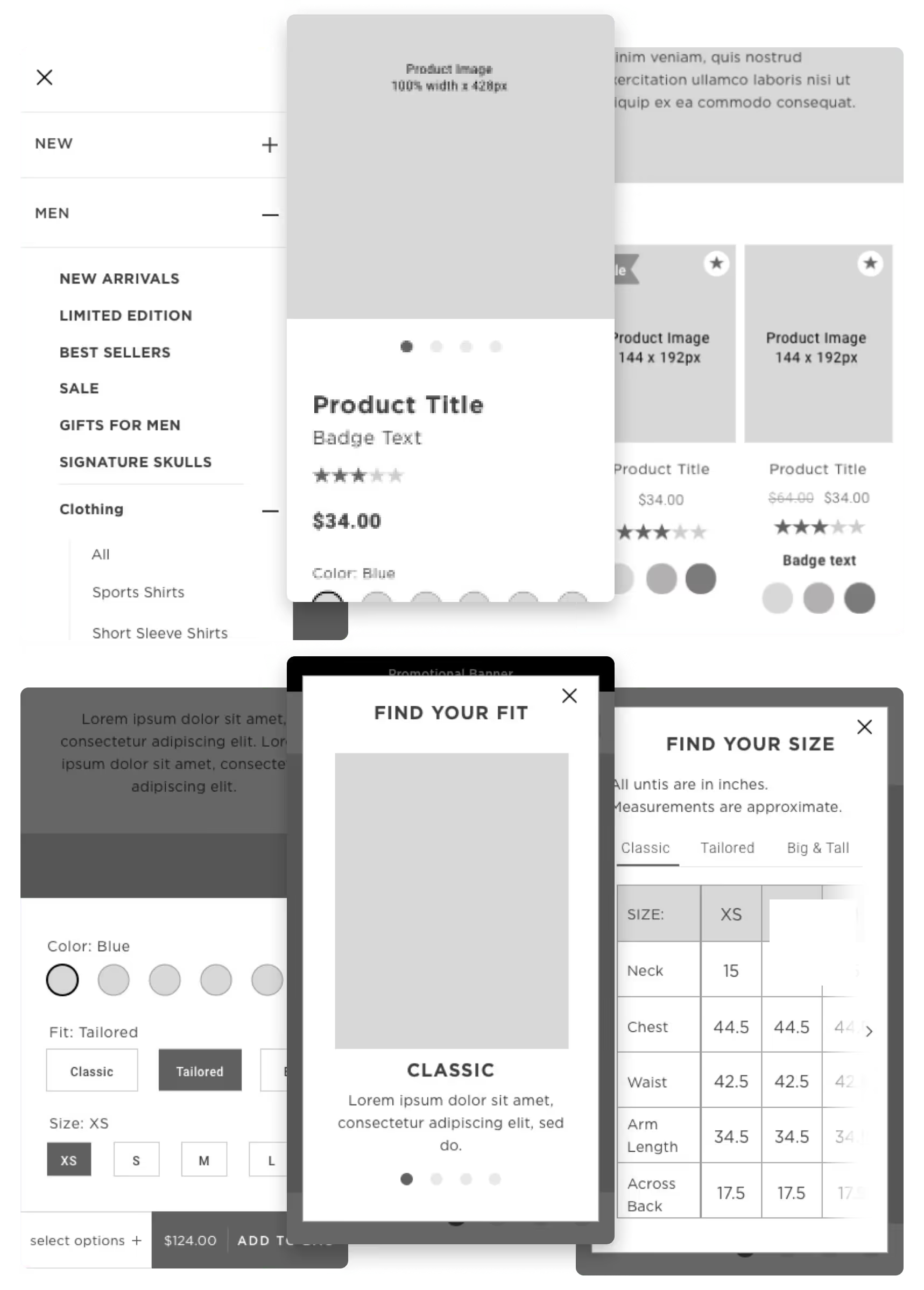
Patterns Galore

To showcase the colorful prints, I incorporated full-bleed images within the category landing page and PDP to place these shots. Also, I designed a hotspot module to help customers understand all the wonderful aspects of the products they're shopping.

Website menu showing men's clothing categories with a light blue polo shirt image and featured product links.
Men's clothing webpage featuring sections for sports shirts, limited edition shirts, t-shirts, and jeans with product images, prices, fit details, star ratings, and navigation menus.E-commerce product page showing a man modeling a black Cape South Sport Coat with detailed size, fit options, reviews, and related products.
Three mobile screens showing a clothing website interface: left screen displays a mobile menu with categories; center screen shows a product detail page for a Cape South Sport Coat with color, fit, and size options, price, short description, and add to bag button; right screen presents a sticky add-to-bag section overlay with coat options and add to bag button.

Art direction

Visual consistency

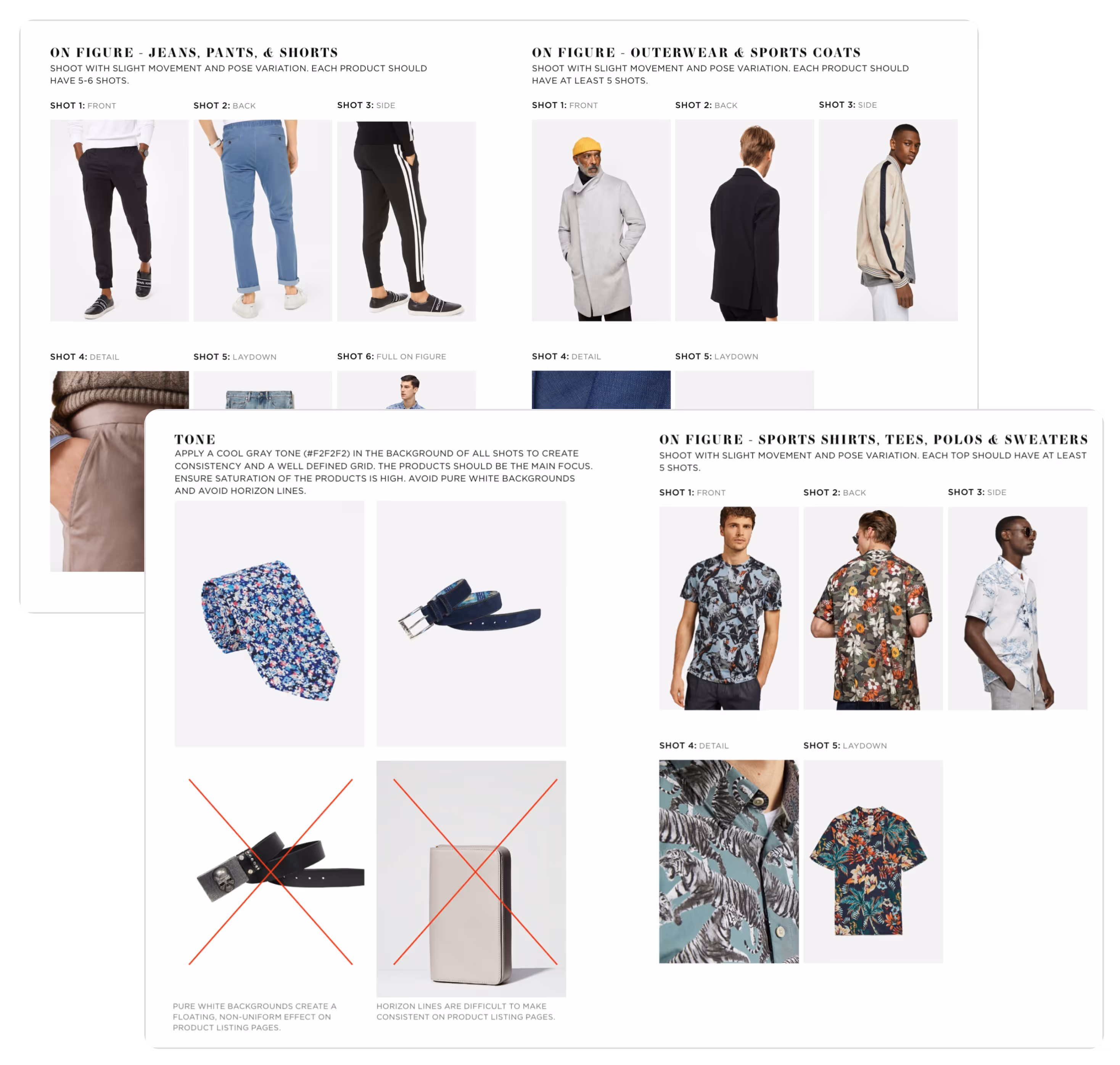
Product photography is a huge factor in a customer's purchase decision. I used my past experience as an ecommerce art director at Kenneth Cole to guide the team at Robert Graham on how to create consistency within their product photography. This included a consistent gray background color, ensuring the rights to use models' faces, and a detailed look at the number of angles/shots each type of product should have.

Guidelines for shooting fashion product photos on figure with multiple examples of jeans, outerwear, and sports shirts shown from front, back, side, detail, and laydown shots against white and gray backgrounds.

Launch

Launch

After several rounds of QA, we launched the site in 2019. The site became easier and cheaper to manage with an improved user experience. Though no user testing was a part of the budget, using best practices we delivered an optimal site experience to help the business grow.

New design = improved KPIs

The site turned out to be clean and what the Robert Graham team was looking for. The site is the winner of 2 Communicator Awards: Visual Appeal & Aesthetic and General Fashion.

KPIs were monitored post-launch over the next year for some fantastic results:

+0%

Conversion Rate vs 2019

+0%

Increase in Sessions in 2020

+0%

Increase in Revenue vs 2019